If people find it difficult to read your brochure because of the font, your brochure will not get read. It's a simple as that! As a result, deciding what font to use with your brochure is essential. That's why we have created the best fonts to use for a brochure.
Usually, when creating a brochure, you will spend a long time deciding what images to use whilst considering layouts, colour schemes and more. However, people will probably spend less time choosing a font.
With this in mind, we are taking a look at the best fonts to use for brochures.
1. Century Gothic
Century Gothic is a popular font used for brochures and print. The font was created in 1991. However, the Century Gothic design is heavily influenced by the geometric sans serif style of the 1920s & 30s.
Century Gothic is the perfect choice for headlines because of its straightforward, clean design. Also, because of this, it's easy to read, making it an excellent choice for brochures. Not only it is popular in print it's also popular in media. The Television show 'Star Trek: Enterprise' and the band, 'Franz Ferdinand', uses Century Gothic font.
Overall Century Gothic is a neat and tidy font yet modern with its sleek sans serif finish.

2. Helvetica
Helvetica is a trendy font for brochures due to its clean, practical form. Designed in 1957 by Max Miedinger, the Helvetica font developed and expanded to many different font weights. Today there are 34 different fonts in the Helvetica family.
Helvetica is generally used sans serif type that is easy to read, making it the right choice for brochures. Also, there are plenty of commercial brands that use Helvetica such as Panasonic, Toyota, Harley Davidson and more.
In short, Helvetica is one of the most popular typefaces in the world. It's fantastic font choice for the brochure with its neat and tidy design which is easy to read.

3. Verdana
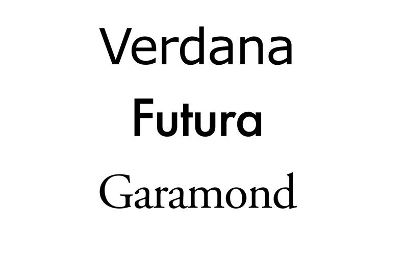
Verdana was initially designed for computer monitors. It was designed by Matthew Carter for Microsoft in 1996 to address the challenges of on-screen display. However, due to the straightforward, simplistic typeface it great for brochures and print.
Verdana is relatively bold and expansive, and thus it still practical if the font is small. Also, it still looks ok on low-resolution laser printers once printed. Although, it is at higher resolutions that it can be fully appreciated.
Several famous brands use Verdana such IKEA, who changed their typeface to Verdana in 2009 from Futura.
Even this typeface was originally developed for computers, it is very much a practical font to use in brochures and remains a popular choice print.

4. Futura
Futura is a timeless classic font that looks very good on print and brochures. It was designed by Paul Rennar in 1927, a German typographer, while the typeface was inspired by the Bauhaus design.
Its simple geometric forms portray a modern appearance and Futura looks great especially when used for headlines and body fonts.
The typeface was notably used by Volkswagen, Crayola, HP and more.

5. Garamond
The Garamond typeface is very popular in print. It is often used in book printing and body text but it is also suitable for brochures. Garamond denotes a naturally structure style which has a similar resemblance to handwriting.
Garamond was invented by Claude Garamond (1480 - 1561) who was an engraver. The typeface decline in popularity in the 18th and 19th century. However, there has been a revival of the font with the most common being Monotype Garamond. More recently, Adobe Garamond is used, which was developed in the 2000s.
Garamond has been used for many famous brands, including Microsoft, Harry Potter, Google's logo and more.
Overall Garamond is a fantastic choice for a brochure and all things print.

If you are looking to showcase your latest product range or keep customers updated about your business with a brochure, Birtwells can help. We take care of the full process from design to print, so whatever idea you have in mind contact us today and we will help.


