Whether you need a brochure to market your business, an event or to do a mail campaign, creating a brochure that draws attention can be difficult, especially when people see tons of brochures.
With this in mind, we have created a list of the 10 ten tips to make your brochure design stand out from the crowd.
1. Know your customer
Before you start to think about brochure design you need to know your customer. This is so you can create content that resonates with your audience, and you can plan precisely what you want to achieve from the brochures.
2. Use fonts that complement the design
There are probably a maximum of three fonts you need to consider, the headline font, subheading font and body font. As a result, you need to choose a font that compliments the design of the brochure. Also if you are using imagery, you to strike the right balance between the use of font and images. Moreso, you can add colour to fonts which can emphasise communication and get your message across to your audience.
3. Choose the right paper stock
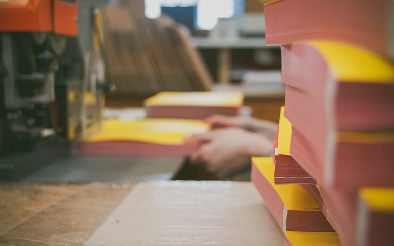
Choosing the right paper stock can have an impact on how your brochure looks and feels. You need to consider who will be handling the brochure as this might influence the design. For example, if you choose a heavier paper stock keep in mind, it would cost you more if the brochures are delivered by mail, than using lighter paper stock. Also, you need to think about what your audience will do with the brochure. Will, the customer, need to write on the brochure if so you need to choose uncoated paper in contrast to glossy paper.
4. Content is King
Have you ever heard of the saying content is king? It is when it comes to copywriting. First, it is essential to grab the readers attention with the headline. Also, you need to create a copy that encourages your reader to read on and direct them with a clear call to action. It is often that copywriting is overlooked, but it probably the most crucial part when creating marketing material.

5. Put customer first
Make it easy for the customer to find the information they need, don’t clutter pages with too much text and images. Make it easy for the customer to open and close the brochure.
6. Clear and simple design
More is less. This should transpire in your brochure design. Often simple design ideas are usually the best designs and catch the readers eye.
7. Bring your idea to life
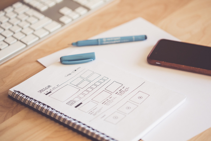
Once you have thought of a concept, it is good to start sketching ideas. Create two or three drafts and show your friends and family. Gather feedback and stick with one final draft to develop.
8. Develop & finalised
Once you developed your idea, play about with different fonts. Don’t restrict your font selection, choose up to 20 fonts so you can test and decide which font looks best and suits your brand. Ask yourself questions such as is it easy to read, is the font too small or too large.

9. First impressions count
Whatever organisation it is your brochure should reflect on how you what people to perceive your brand. For example, if you're a charity should your advertisement reflect that you have spent a lot of money on brochures? Probably not. In contrast, if your brochure is trying to sell expensive products, it is probably best to invest in a heavy weighted paper stock with a quality finish.
10. Images
The final touch is making your brochure design standout. Using high-quality images an enhance the appearance of the brochure as well as making it more pleasurable for your customers to read. On the other hand, using poor, pixelated photos could discourage customers to picks it up.

At Birtwells, we can take the hassle out of brochure design and create a bespoke, beautiful looking brochure, from design to print. Whatever type of brochure you need we have a range of options available from folded leaflets to wire-bound documents and saddle snitch finishes. Contact us today if you need a brochure designed or printed.


